The Boundless Mind
When every brand tries to stand out the same way
Date:
August 18, 2026
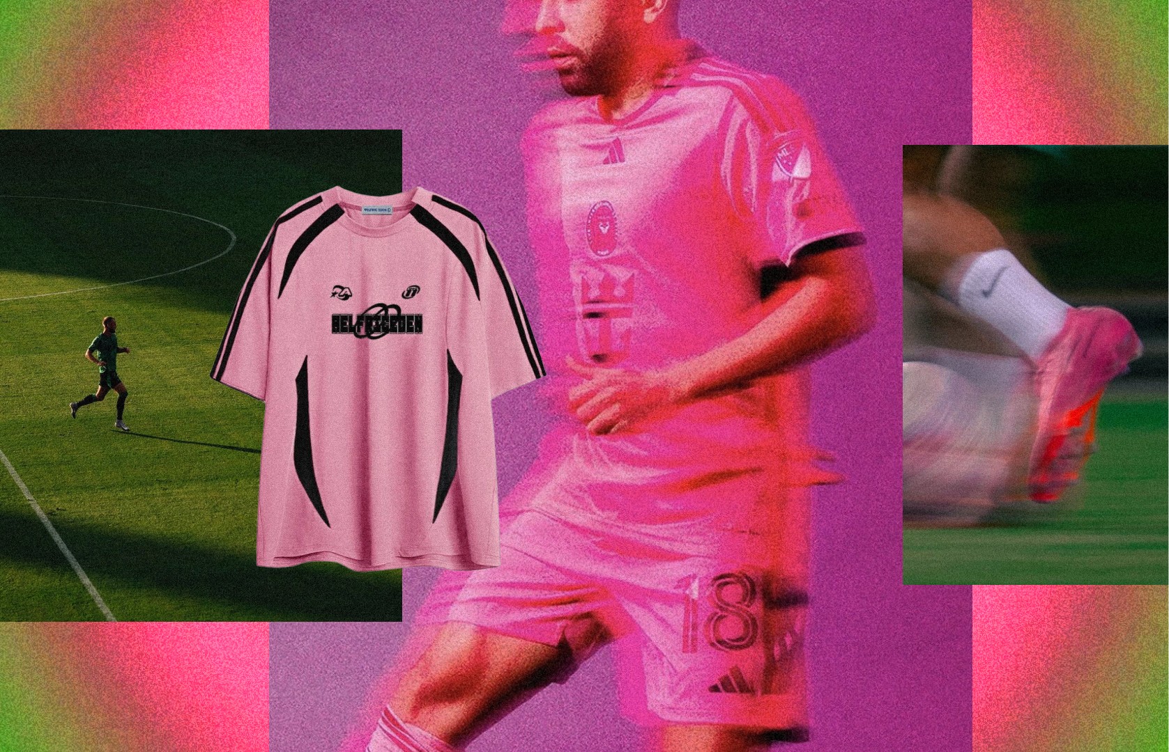
Seven out of every ten players at this World Cup are wearing hot pink boots. Not the same brand. Nike, Adidas, Puma, New Balance, and Skechers all independently released pink collections for the tournament, each one designed to be the most visible product on the pitch.

What the World Cup's hot pink boots reveal about how signalling actually works
Seven out of every ten players at this World Cup are wearing hot pink boots. Not the same brand. Nike, Adidas, Puma, New Balance, and Skechers all independently released pink collections for the tournament, each one designed to be the most visible product on the pitch. The result is that when you watch a match, every foot looks the same, and unless you zoom in close enough to read a logo, you genuinely cannot tell which brand anyone is wearing. Every single one of these companies spent two to three years developing a product meant to differentiate itself from the competition, and they all arrived at an identical answer.
The technical reason is real, but it's not the interesting part
Pink sits directly opposite green on the colour wheel, which makes it the highest contrast colour available against a grass pitch. Product testing confirmed it. Broadcast visibility confirmed it. And no participating country at this World Cup wears a primarily pink kit, so the boots are guaranteed not to clash or disappear into the uniform. That's the engineering logic, and it holds up. But engineering logic doesn't explain why five competing companies all followed it to the same place at the same time, because the point of competitive product design is to arrive somewhere your rivals didn't.
How five brands ended up in the same place
Part of this is structural. The sportswear industry runs on long product cycles, typically two to three years from concept to shelf, and during that window there's significant scope for information to travel between brands. They trade employees and executives, draw insights from the same agencies and focus groups, and often manufacture in the same factories. Sample leaks, shared research, and overlapping talent pipelines mean that by the time a product reaches the pitch, the strategic thinking behind it has been circulating through the industry for years.
But there's a simpler explanation sitting underneath that, and it's the one that matters most for anyone thinking about brand strategy. In 2024, WGSN and Coloro, the trend forecasting services that large parts of the fashion and sportswear industry subscribe to, named "Electric Fuchsia" as the defining colour of 2026. That single prediction, distributed to paying clients across every major brand, effectively handed every competitor the same brief. Each brand then executed that brief independently, believing it was making a bold, differentiated choice, without realising that every other brand in the category was making the same bold, differentiated choice from the same starting point. The result isn't coordination. It's convergence, and convergence is what happens when an entire industry optimises for the same signal at the same time.
What this actually looks like from the outside
The irony is precise enough to be worth sitting with. In 2008, Nike released the first pink football boot and the press treated it as a scandal. Nicklas Bendtner wore them onto the pitch and tabloids ran it as a stunt. Pink was reserved for the most reckless, attention seeking players, the ones whose personality could absorb the risk of wearing something that provocative in a sport still deeply conservative about what men were supposed to look like on the field. Eighteen years later, that same colour is the single most common thing on the pitch, worn by defenders, goalkeepers, and midfielders who would never have been associated with flair or showmanship. Pink didn't become acceptable because football changed its mind about the colour. It became acceptable because enough data confirmed it worked, enough brands adopted it, and enough players wore it that the risk of standing out disappeared entirely. The colour that was once too loud to wear is now too safe to avoid.
And that safety is exactly the problem, from a brand perspective. The whole point of a World Cup boot launch is to create a visual signature so distinctive that a fan watching on a phone screen can identify the brand from the colour alone, without needing to see a logo. Pink was supposed to be that signature. Instead it became a uniform, and a uniform, by definition, belongs to nobody.
What this teaches about signalling
There's a useful distinction buried in here between two kinds of brand signalling that often get confused. The first is individual signalling, where a single brand makes a choice so specific and committed that it becomes recognisable as theirs alone. The second is herd signalling, where an entire category converges on the same choice because the underlying data, the trend forecasts, and the consumer research all point the same direction. Individual signalling builds brand equity. Herd signalling builds category visibility. They look similar from a distance, but they produce completely different outcomes for the brands involved.
What happened at this World Cup is a textbook case of the second. Pink didn't make any single brand more recognisable. It made the category of "World Cup football boot" more visible as a whole, which benefits the market but rewards no individual player in it. The brands collectively increased the signal strength of the entire pitch without any one of them capturing the value of having done so.
Messi, interestingly, is one of the few players not wearing pink at this tournament. Whether that's a contractual choice or a personal one, the visual effect is the same, he's now the most visually distinctive player on the field precisely because he opted out of what everyone else opted into. There's a lesson sitting in that too.
So what about this is actually worth noticing
The World Cup's pink boots aren't really a colour story, they're a strategy story wearing a colour. When an entire industry subscribes to the same trend forecast, draws from the same research, and optimises for the same metric, the result isn't differentiation, it's convergence dressed up as boldness. The brand that stands out in a sea of sameness is rarely the one that followed the data most faithfully. It's the one that had the conviction to read the room and go somewhere else entirely.
For anyone building a brand, the question worth asking isn't whether the data supports your choice. It's whether the same data is supporting everyone else's choice too, because if it is, the boldest move available might be the one the forecast didn't predic